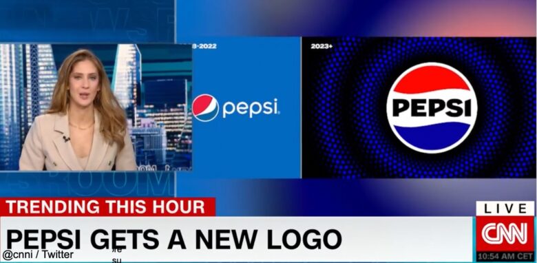
Pepsi’s logo design is to be revamped for the first time in 14 years.
On Tuesday 28 March, PepsiCo, the parent company of the soda brand known as Pepsi, announced a change to the brand logo.
According to PepsiCo, the name ‘PEPSI’ will now appear in a modern, custom font and in the centre of a circle as part of the brand logo change.
Old design on left, new design on right↓↓↓.
Pepsi has changed their logo. pic.twitter.com/BXQP4d3t9G
— Pop Base (@PopBase) March 28, 2023
Pepsi has a new logo https://t.co/tttktPhUOg pic.twitter.com/AXWv58Gtkc
— CNN International (@cnni) March 29, 2023
The company’s press release announced that the design of the stripes within the circle will be replaced and the colours will also change. Previously, the circle had a wavy stripe pattern of red, white and blue, with the PEPSI logo in thin white letters below the edge.
The new colours are black and electric blue. The colour of the stripes remained unchanged, but the word ‘PEPSI’ appeared in bold black letters in the centre of the circle.
PepsiCo stated that the reason for choosing black was “to further express the brand’s desire for Pepsi Zero Sugar in the future”.
The announcement was accompanied by Pepsi’s chief marketing officer, Todd Kaplan, who unveiled the new photo logo on Twitter.
In a news release, Todd Kaplan said, “This exciting, modern look is a bigger, bolder expression of the brand’s character and will help people find new ways to enjoy what they love, each in a dignified way” and added, “This new visual The new visuals bring out the best of the Pepsi brand’s rich heritage, while at the same time taking it a giant step forward towards success in an increasingly digital world”, he added confidently.
The new designs will be available in North America from the autumn of this year, followed by a gradual roll-out to the rest of the world.


コメント